
Nike Free Run+ Design Analysis

This is a design analysis of the Nike Free Run+ advertisement. This running shoe line debuted in 2011 introducing a more flexible running shoe which allowed for more natural movement and a sock like fit. The asymmetrical lacing pattern and non-traditional design lines quickly launched this shoe into an icon among modern sport shoes. This analysis will show design principles used in this popular advertisement. (https://www.nike.com/xp/b/genealogyofthefree/zoetrope.html)
Contrast

Contrast is used in three ways in this ad.
First, the contrasting background and the bright purple shoe graphic. Interest for the shoe is instantly created by the high contrast in color between the almost transparent background and the bright purple shoe.
Second, the contrasting size of the font organizes the information in the advertisement. The main slogan in heavy bold lettering while the subtitles are a smaller, lighter version of the same font. Likewise, the shopping link buttons, while using the same font, appear in a different size to designate them as serving a different purpose than the slogan and subheadings.
Third, while the text is horizonatally aligned the shoe graphic is nearly vertical. The contrast creates interest in the design, and aids in making the shoe stand out even more.
Repetition

Repetition in this add is used in the unifying font and the repeated image of the shoe. Likewise the branding is repeated both in the subheading and in the shopping link.
Even though the size of the font is contrasting, the same font is repeated throughout all the text.
The image of the shoe is the most compelling use of repetition. The shoe is shown in what looks like various stages of flexibility giving the impression of movement. In a sense, this is a visual repetition of the subtitle which proclaims the shoe’s flexibility. This form of repetition brings continuity to the graphic and text.
Alignment
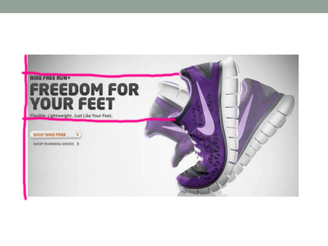
The text in this advertisement is all left flush adding organization and connection to all the various elements of the text. Also, there is a subtle alignment of the text block containing the main slogan and subtitles. It lines up with the opening of the flexed shoe giving the impression that the words come from the shoe itself. This alignment adds another element of cohesion between the text and the graphic.
Proximity

The use of proximity organizes the pertinent information in this ad. The slogan, brand, and tagline are all clumped together in one block. The shopping links are separate from the bulk of the text but near enough to indicate and important connection.
There is also ample white space included which gives a light feel to the advertisement. This airy feeling is an important part of selling this sport shoe as a lightweight option.
Color

The varied color palette in this advertisement helps to showcase selling points of this shoe. The shoe itself is a cool toned purple which is both calming and pleasing to the eye yet bold enough to stand out and be the central focus of the ad. There is also a good use of tint helping the “moving” images of the shoe to almost fade into the background.
The color of the font is an echo of the charcoal black used in the shoe. There is one small icon used as a shopping link to “SHOP NIKE FREE” that is a complementary shade of orange. This causes the icon to stand out while the size keeps it from overpowering the image of the shoe.
The background sets the perfect stage for the font and the graphic to stand out. The varying gradient of gray allows for the center of the advertisement to act a as a frame showcasing the shoe itself.
Conclusion
The principles of design (contrast, repetition, alignment, proximity, and color) are successfully used to create an evocative image in this shoe advertisement. These cohesive design elements echo the sentiment of the slogan, giving the feeling that the shoe is indeed flexible and lightweight and would be an appealing running shoe to purchase.
