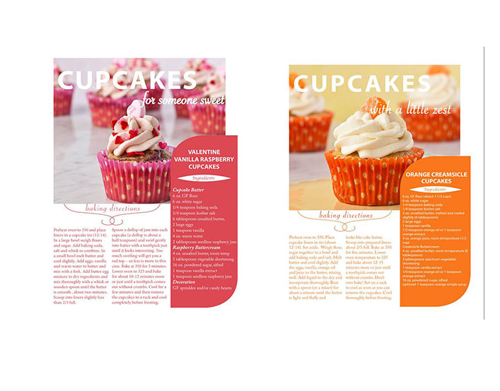
The magazine spread created by Lori Szkodzinski, a website specialist, for Starlight Cupcakes was published on Behance on November 10, 2012. It can be viewed on https://www.behance.net/LoriSzkodzinski. This spread depicts two different cupcake recipes and employs a variety of typefaces and photography composition rules to construct a well designed magazine spread. You could even call it a sweet spread.

Typography
Lori Szkodzinski utilizes three different categories of typefaces in her spread: sans serif, oldstyle, and script. The lack of serifs on the main title for the page and the recipe box indicate they are both set in a sans serif font (indicated by blue line). The recipe for the orange creamsicle cupcakes is likewise composed in a sans serif style font, albeit in a much lighter weight version. The subheadings and the small graphic acting as the title “Ingredients” for the recipe block on each page are written in a script font (indicated by purple line). You can tell these fonts are script because they look like they could have been written calligraphy style. The bulk of the body text, which gives the ingredients list and directions for baking the cupcakes, utilizes an oldstyle font (indicated by pink line). This font demonstrates the classic “thin-thick” strokes, serifs, and a diagonal stress.

A good contrast is made between the main title and the subheading because of the combination of the large, mono-weight sans serif font in the title and the smaller calligraphy like script subheading. The sans serif font in the main title creates a rectangular shape contrasted by the subheading with its varying ascenders and descenders (letters that are taller than the x-height or lower than baseline).
The weight of the font is also used to create contrast, with the heading being a heavy weight and the script being lighter weight, and the copy text being even lighter. Upon a close examination you can see that two different script fonts are used, yet they both “match” the recipe, the softer script font with the sweet berry cupcake and the sharper script font with the zesty orange cupcake. However, because they are both in the script family it unifies them as a whole within the spread.

The lightweight, small oldstyle font is utilized successfully as the serifs and the curved strokes with a diagonal stress create a good typeface for reading body copy by drawing the eye across the page. The spacing permits the text to be more “white” in the background allowing the photograph to draw the reader in, yet also successfully conveying the information the reader would need to create the cupcake in the picture.
Overall, the bold heading is necessary to balance out the amount of copy at the bottom of the page. However the amount of copy does not overwhelm the design because it is set in a light weight font and spaced to create more open space. This makes it easier to read an add to the overall balance of the design in the spread.
Photography
The creator of these magazine spreads, Lori Szkodzinski, employs the leading lines, rule of thirds, and depth of field techniques in the photos for this spread.

On the page for the Valentine cupcakes, there are two rows in the background that give the impression two diagonal lines traveling down across the page. These lines draw your eye past the delicious cupcake in the forefront to the list of ingredients which encourages the reader gather the components and start baking. In the photograph of the orange cupcake the lines created by the placement of the cupcakes follow the horizontal lines that you would look for when following the principle of rule of thirds.
On both pages depth of field is utilized to give contrast between the background and the cupcake in the foreground. The cupcakes are strategically placed in foreground, middle, and background positions. The camera also slightly blurred the background cupcakes so they blend into the background, bringing the focus the the foremost cupcake.
Alternate Images for Layout
I experimented with creating my own images that would work in this layout. After making the cupcake, which my family was thrilled about, I arranged them attempting to recreate the same use of leading lines and depth of field. The line created by the background rows of cupcakes in my photograph is more horizontal than diagonal but it still follows the rule of thirds so I think it would work.

This alternative photo creates a better diagonal line in the rear. This line is then repeated by the line in the foreground which is created by the addition of strawberries placed in a line. This second photograph also is a better representation of depth of field because the exaggerated diagonal line and the increased distance between the foreground and background objects. In both photographs the foreground cupcake is centered to allow for the addition of the text block that contains the list of ingredients.

I also tried to recreate a similar image with the orange cupcakes by placing a cupcake in the background, middle and foreground in order to give depth of field. I added the orange paper to work as a pop of color as the original photograph had done.
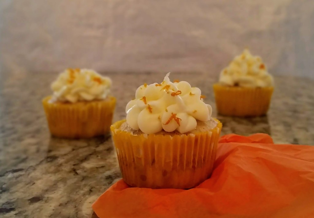
Additionally, I experimented with adding some small oranges to the photograph for more color and another layer to contribute to the depth of field. I thought the repetitive element of the fresh fruit would unite the two photographs. This second image also utilizes the rule of thirds as the two cupcakes in the rear line up with intersecting graph points. As with the pink cupcakes the foreground cupcake is centered so it will work with the addition of text that would be used in this magazine spread.

Summary
The typography and the photography in this magazine spread created by Lori Szkodzinski work together to bring the eye directly to the cupcake pictured front and center on the spread. Likewise, the appealing contrast of text grabs the attention of the reader. Then the titles, body copy, and text box surround that same cupcake acting almost as a frame which makes the cupcake stand out even more. Drawing the eye to the cupcake, pulls the reader in peaking interest, and then the text gives the information the reader would need to recreate that cupcake for themselves. This successful arrangement of text and photography makes for an effective magazine spread.
