Be yourself; Everyone else is already taken.
— Oscar Wilde.
This is the first post on my new blog. I’m just getting this new blog going, so stay tuned for more. Subscribe below to get notified when I post new updates.
Be yourself; Everyone else is already taken.
— Oscar Wilde.
This is the first post on my new blog. I’m just getting this new blog going, so stay tuned for more. Subscribe below to get notified when I post new updates.
America’s favorite cookie is celebrating the stuff that makes two halves, whole in this ad campaign directed by Eva M. Steiner and written by Jonathan Meir Hirsch. This campaign utilizes anthropomorphic illustrations of Oreo cookies to represent how the cream filling brings together the two cookies to make the delicious cookie that everyone knows and loves. The various images also show relationships such as father and son, Mother and daughter, or individuals in a loving relationship to portray how, just like the cream filling in Oreo cookie, love can connect two people. The image below is one in a series of four illustrations used in this campaign.
Ms. Steiner and Mr. Hirsch utilized elements of contrast, repetition, alignment, and proximity to create this charming ad for Oreo cookies.

The principle of contrast (indicated by the black arrows) adds to the simplicity of the design. The plain solid background allows for the illustrations and typography to stand out. Thin lines are repeated throughout the design and the typography (as indicated by the red lines). Alignment (indicated by the pink lines) is achieved by the horizontal lines repeated in the text and illustration. The text and the illustration also are right-aligned vertically within the add. Lastly, the principle of proximity (as indicated by the yellow lines) helps convey the message by placing like things together. The text is close together at the bottom of the page. The two cookies, even though they are on opposite sides of the page, are connected by the white line of the tin can phone. This conveys the message of the ad as the white line represents the cream filling that holds the cookies together. All of these elements together create cohesion and keep the design simple in nature just like the message of the ad and the cookie itself.
The designers used classic Oreo branding colors to create this fun ad campaign.
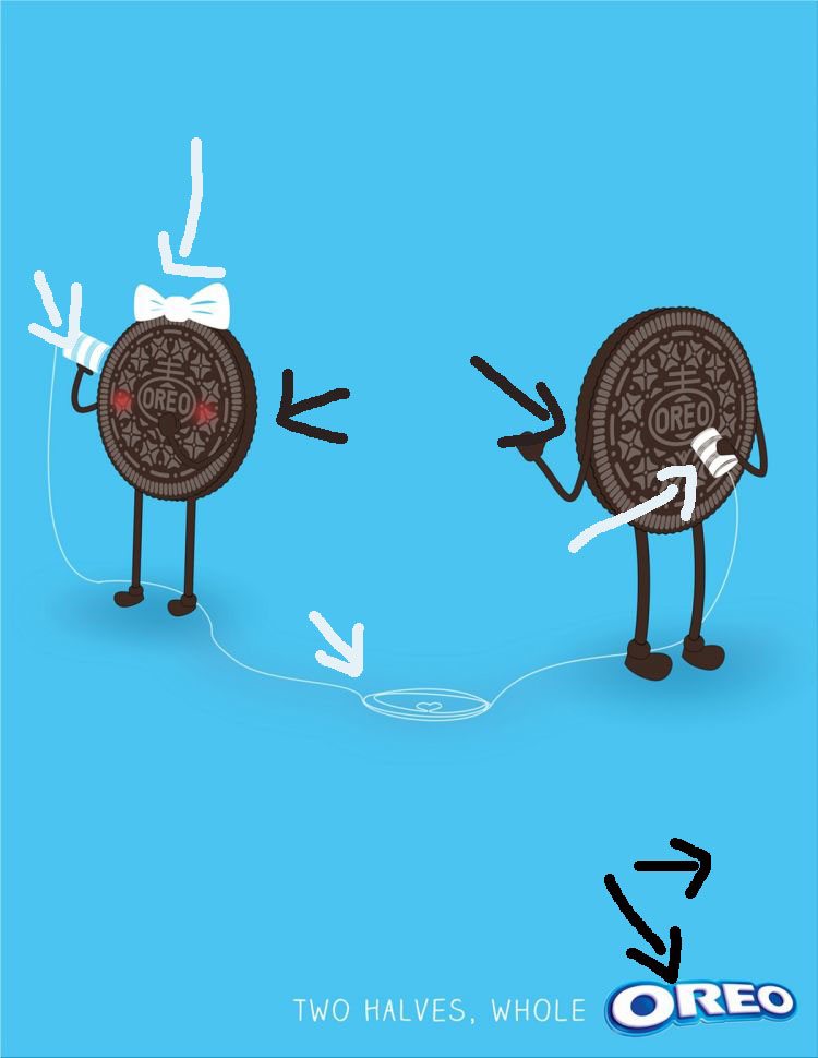
We are all familiar with the classic blue and white packaging and the color of the Oreo cookie. The designers used those colors as a simple color palette for their design of this ad. The blue background is a lighter tint of the classic blue taken from the logo (as indicated by the black arrows). The white elements used in the typography and illustration (the bow, the tin cans, and the string) are evocative of the white cream filling found in an Oreo cookie (as indicated by the white arrows). While the cookies in the illustration, along with the anthropomorphic arms and legs, are the classic Oreo cookie chocolate brown color (as indicated by the brown arrows).
While there is very little body copy in this ad, the typography used is simple yet effective in conveying the simplicity of the design message.

A contrasting structure of the logo and tagline typography (indicated by the black lines) create emphasis and visual interest. While both fonts are non-serif, the Oreo logo utilizes a heavy weight thick stroke, while the tagline is written with a light weight thin stroke. This contrast adds a visually appealing element to the typography. Similarly, the font used for the tagline is reminiscent of the font you find on the Oreo cookie itself (as indicated by the red lines). Both fonts share the same all caps form and kearning that draws the letters close together. The white color and style of the font are also similar to the thin line on the tin can phones add yet another element of repetition in the typography. These elements work together well to create a simple yet visually interesting ad.
In an attempt to create another ad that would fit with the original campaign I tried to use similar design elements to the original ad. In my ad the element that draws these two cookies together is the white “cream filling” baby. As in the other ad from this campaign there is an element represented in white, reminiscent of the cream filling, that draws the two cookies together. I also repeated small details in the design such as the bow, the rosy cheeks on the “mom” cookie, and similarly stylized arms and legs.
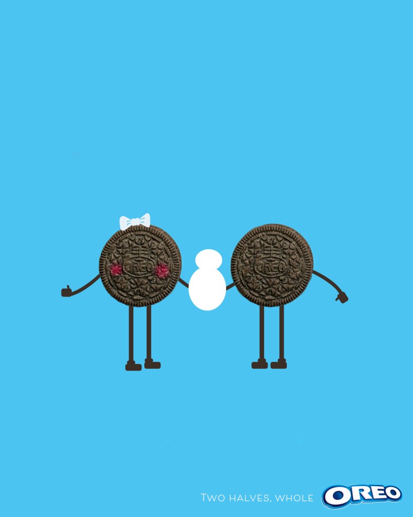
As in the original ad I utilized the same basic blue background and simplistic illustrations and typography to achieve similar elements of contrast (as indicated with the black arrows). I utilized the repetition of thin lines in the arms and legs and typography (as indicated by the red lines). Similarly, I created the same horizontal lines of alignment (as indicated by the pink lines( in the ad with the cookie people aligned and the text aligned within the ad. I kept with a similar principle of proximity (as indicated by the yellow lines) by placing the text together with the logo and the elements of the illustration close together. This shows that they go together and further emphasizing the message of the ad. In this ad the cookies are connected by the baby rather than a string on a tin can phone, however the sentiment of the campaign is kept in that the love of the baby is what draws these two cookies together.

To keep my ad looking like it could belong with the original campaign I utilized the same color palette that is taken from the classic blue and white packaging and the color of the Oreo cookie. I used the same blue hue for the background which is a lighter tint of the logo (as indicated by the black arrows), white for the cream-filling baby and typography (as indicated by the white arrows), and and image of an Oreo cookie with arms and legs colored to match the cookie (as indicated by the brown arrows. I tried to use these elements of color to help convey a the same message of togetherness and love demonstrated by the original ad.

Like the elements of design and color, I attempted to keep my use of typography as close to the original as possible. I utilized the original heavy weight stroke Oreo logo (as indicated by the red line) aligned with a thin, light weight sans serif font in white (as indicated by the black lines). While the font used for the tagline it is not a perfect match to the original, I feel it creates much the same feeling as the original. It has a sans serif structure, a thin, light-weight stroke, and the all caps form that the original font used. Thus, is creates the same visual interest to the original ad.

My ad blends in nicely with the original ad campaign as it uses similar design elements to convey the same message as the original ad. The art director Eva M. Steiner and copy writer Jonathan Meir Hirsch created this Oreo cookie campaign using anthropomorphic illustrations of Oreo cookies. These charming illustrations represent how the cream filling brings together the two cookies to make the delicious cookie that everyone knows and loves. The image I chose from the campaign show two cookies connecting through the use of a tin can phone. Based on the design elements used by the creators of this ad, including contrast, repetition, alignment, proximity, color, and typography, I created my own ad that follows these principles of design to create an add of two cookies brought together by their mutually shared love of their “cream-filling” baby. The sentiment and design principles in my ad work in harmony with the original ad campaign and would make a nice addition to the body of work created by Eva M. Steiner and Johnathan Meir Hirsch.
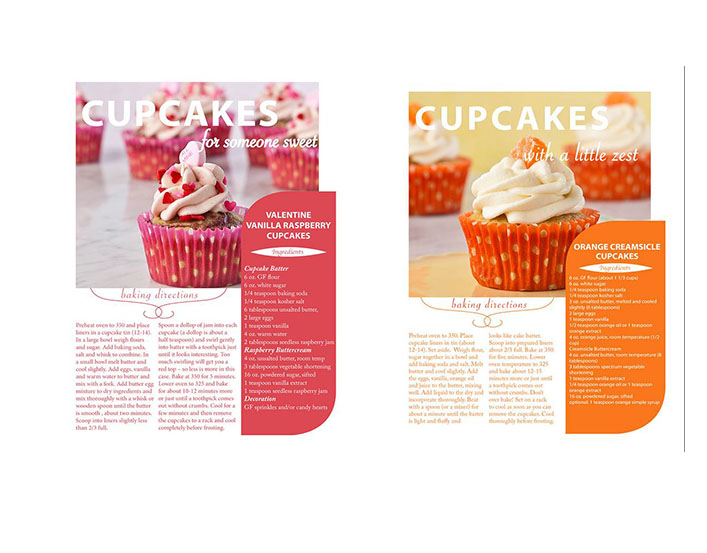
The magazine spread created by Lori Szkodzinski, a website specialist, for Starlight Cupcakes was published on Behance on November 10, 2012. It can be viewed on https://www.behance.net/LoriSzkodzinski. This spread depicts two different cupcake recipes and employs a variety of typefaces and photography composition rules to construct a well designed magazine spread. You could even call it a sweet spread.

Lori Szkodzinski utilizes three different categories of typefaces in her spread: sans serif, oldstyle, and script. The lack of serifs on the main title for the page and the recipe box indicate they are both set in a sans serif font (indicated by blue line). The recipe for the orange creamsicle cupcakes is likewise composed in a sans serif style font, albeit in a much lighter weight version. The subheadings and the small graphic acting as the title “Ingredients” for the recipe block on each page are written in a script font (indicated by purple line). You can tell these fonts are script because they look like they could have been written calligraphy style. The bulk of the body text, which gives the ingredients list and directions for baking the cupcakes, utilizes an oldstyle font (indicated by pink line). This font demonstrates the classic “thin-thick” strokes, serifs, and a diagonal stress.

A good contrast is made between the main title and the subheading because of the combination of the large, mono-weight sans serif font in the title and the smaller calligraphy like script subheading. The sans serif font in the main title creates a rectangular shape contrasted by the subheading with its varying ascenders and descenders (letters that are taller than the x-height or lower than baseline).
The weight of the font is also used to create contrast, with the heading being a heavy weight and the script being lighter weight, and the copy text being even lighter. Upon a close examination you can see that two different script fonts are used, yet they both “match” the recipe, the softer script font with the sweet berry cupcake and the sharper script font with the zesty orange cupcake. However, because they are both in the script family it unifies them as a whole within the spread.

The lightweight, small oldstyle font is utilized successfully as the serifs and the curved strokes with a diagonal stress create a good typeface for reading body copy by drawing the eye across the page. The spacing permits the text to be more “white” in the background allowing the photograph to draw the reader in, yet also successfully conveying the information the reader would need to create the cupcake in the picture.
Overall, the bold heading is necessary to balance out the amount of copy at the bottom of the page. However the amount of copy does not overwhelm the design because it is set in a light weight font and spaced to create more open space. This makes it easier to read an add to the overall balance of the design in the spread.
The creator of these magazine spreads, Lori Szkodzinski, employs the leading lines, rule of thirds, and depth of field techniques in the photos for this spread.

On the page for the Valentine cupcakes, there are two rows in the background that give the impression two diagonal lines traveling down across the page. These lines draw your eye past the delicious cupcake in the forefront to the list of ingredients which encourages the reader gather the components and start baking. In the photograph of the orange cupcake the lines created by the placement of the cupcakes follow the horizontal lines that you would look for when following the principle of rule of thirds.
On both pages depth of field is utilized to give contrast between the background and the cupcake in the foreground. The cupcakes are strategically placed in foreground, middle, and background positions. The camera also slightly blurred the background cupcakes so they blend into the background, bringing the focus the the foremost cupcake.
I experimented with creating my own images that would work in this layout. After making the cupcake, which my family was thrilled about, I arranged them attempting to recreate the same use of leading lines and depth of field. The line created by the background rows of cupcakes in my photograph is more horizontal than diagonal but it still follows the rule of thirds so I think it would work.

This alternative photo creates a better diagonal line in the rear. This line is then repeated by the line in the foreground which is created by the addition of strawberries placed in a line. This second photograph also is a better representation of depth of field because the exaggerated diagonal line and the increased distance between the foreground and background objects. In both photographs the foreground cupcake is centered to allow for the addition of the text block that contains the list of ingredients.

I also tried to recreate a similar image with the orange cupcakes by placing a cupcake in the background, middle and foreground in order to give depth of field. I added the orange paper to work as a pop of color as the original photograph had done.
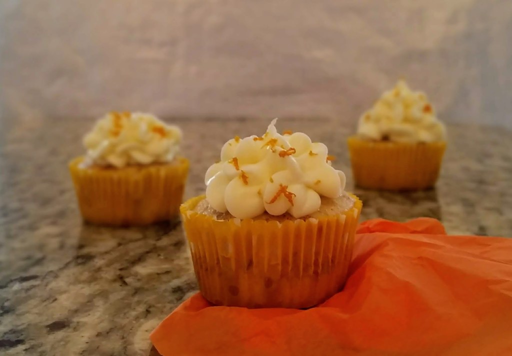
Additionally, I experimented with adding some small oranges to the photograph for more color and another layer to contribute to the depth of field. I thought the repetitive element of the fresh fruit would unite the two photographs. This second image also utilizes the rule of thirds as the two cupcakes in the rear line up with intersecting graph points. As with the pink cupcakes the foreground cupcake is centered so it will work with the addition of text that would be used in this magazine spread.

The typography and the photography in this magazine spread created by Lori Szkodzinski work together to bring the eye directly to the cupcake pictured front and center on the spread. Likewise, the appealing contrast of text grabs the attention of the reader. Then the titles, body copy, and text box surround that same cupcake acting almost as a frame which makes the cupcake stand out even more. Drawing the eye to the cupcake, pulls the reader in peaking interest, and then the text gives the information the reader would need to recreate that cupcake for themselves. This successful arrangement of text and photography makes for an effective magazine spread.


This is a design analysis of the Nike Free Run+ advertisement. This running shoe line debuted in 2011 introducing a more flexible running shoe which allowed for more natural movement and a sock like fit. The asymmetrical lacing pattern and non-traditional design lines quickly launched this shoe into an icon among modern sport shoes. This analysis will show design principles used in this popular advertisement. (https://www.nike.com/xp/b/genealogyofthefree/zoetrope.html)

Contrast is used in three ways in this ad.
First, the contrasting background and the bright purple shoe graphic. Interest for the shoe is instantly created by the high contrast in color between the almost transparent background and the bright purple shoe.
Second, the contrasting size of the font organizes the information in the advertisement. The main slogan in heavy bold lettering while the subtitles are a smaller, lighter version of the same font. Likewise, the shopping link buttons, while using the same font, appear in a different size to designate them as serving a different purpose than the slogan and subheadings.
Third, while the text is horizonatally aligned the shoe graphic is nearly vertical. The contrast creates interest in the design, and aids in making the shoe stand out even more.

Repetition in this add is used in the unifying font and the repeated image of the shoe. Likewise the branding is repeated both in the subheading and in the shopping link.
Even though the size of the font is contrasting, the same font is repeated throughout all the text.
The image of the shoe is the most compelling use of repetition. The shoe is shown in what looks like various stages of flexibility giving the impression of movement. In a sense, this is a visual repetition of the subtitle which proclaims the shoe’s flexibility. This form of repetition brings continuity to the graphic and text.
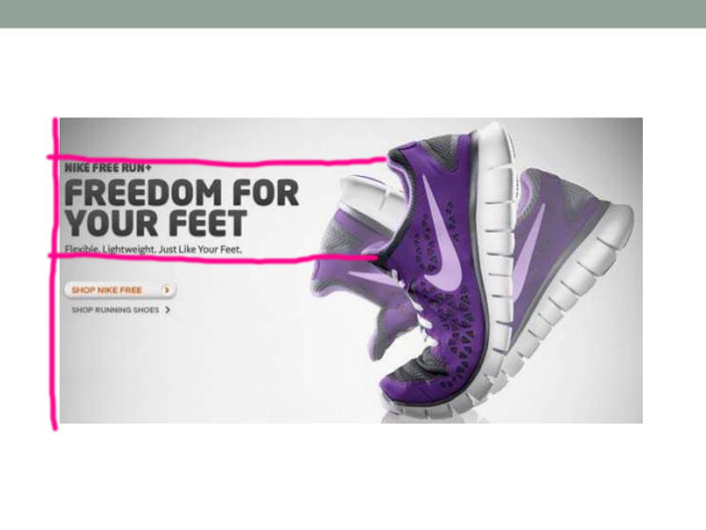
The text in this advertisement is all left flush adding organization and connection to all the various elements of the text. Also, there is a subtle alignment of the text block containing the main slogan and subtitles. It lines up with the opening of the flexed shoe giving the impression that the words come from the shoe itself. This alignment adds another element of cohesion between the text and the graphic.

The use of proximity organizes the pertinent information in this ad. The slogan, brand, and tagline are all clumped together in one block. The shopping links are separate from the bulk of the text but near enough to indicate and important connection.
There is also ample white space included which gives a light feel to the advertisement. This airy feeling is an important part of selling this sport shoe as a lightweight option.

The varied color palette in this advertisement helps to showcase selling points of this shoe. The shoe itself is a cool toned purple which is both calming and pleasing to the eye yet bold enough to stand out and be the central focus of the ad. There is also a good use of tint helping the “moving” images of the shoe to almost fade into the background.
The color of the font is an echo of the charcoal black used in the shoe. There is one small icon used as a shopping link to “SHOP NIKE FREE” that is a complementary shade of orange. This causes the icon to stand out while the size keeps it from overpowering the image of the shoe.
The background sets the perfect stage for the font and the graphic to stand out. The varying gradient of gray allows for the center of the advertisement to act a as a frame showcasing the shoe itself.
The principles of design (contrast, repetition, alignment, proximity, and color) are successfully used to create an evocative image in this shoe advertisement. These cohesive design elements echo the sentiment of the slogan, giving the feeling that the shoe is indeed flexible and lightweight and would be an appealing running shoe to purchase.
This is an example post, originally published as part of Blogging University. Enroll in one of our ten programs, and start your blog right.
You’re going to publish a post today. Don’t worry about how your blog looks. Don’t worry if you haven’t given it a name yet, or you’re feeling overwhelmed. Just click the “New Post” button, and tell us why you’re here.
Why do this?
The post can be short or long, a personal intro to your life or a bloggy mission statement, a manifesto for the future or a simple outline of your the types of things you hope to publish.
To help you get started, here are a few questions:
You’re not locked into any of this; one of the wonderful things about blogs is how they constantly evolve as we learn, grow, and interact with one another — but it’s good to know where and why you started, and articulating your goals may just give you a few other post ideas.
Can’t think how to get started? Just write the first thing that pops into your head. Anne Lamott, author of a book on writing we love, says that you need to give yourself permission to write a “crappy first draft”. Anne makes a great point — just start writing, and worry about editing it later.
When you’re ready to publish, give your post three to five tags that describe your blog’s focus — writing, photography, fiction, parenting, food, cars, movies, sports, whatever. These tags will help others who care about your topics find you in the Reader. Make sure one of the tags is “zerotohero,” so other new bloggers can find you, too.

